Extreme Events
In the section on market crashes we developed the idea that high volatility would lead to more extreme events. Ultimately an extreme event would be significant enough to lead to a bear market. Now we look at extreme events without consideration of what kind of statistical distribution they might have.
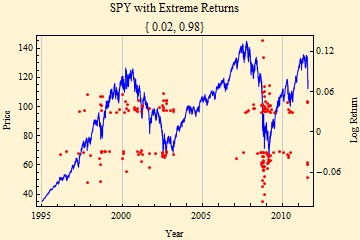
Data from, Tue 3 Jan 1995, Price 34.92, through Fri 12 Aug 2011, Price 118.12.

The graph above shows the price time series with the price scale on the left. The red dots show the days on which extreme returns outside the quantile range [0.02, 0.98] occurred. The scale on the right shows the magnitude of these log returns. The graph rather clearly suggests that the extremes are clustered, consistent with the idea that the distribution of returns is not stationary. This kind of graphic may be more useful in spotting trouble than, looking at volatility averaged over some period. Note, however, that extreme returns began to show up three years before the market peak in 2000.
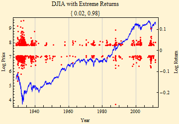
The graph below shows the same quantile range for the Dow Jones Industrial Average time series, but log price is plotted to better show the volatility over the longer time frame.
Data from, Mon 1 Oct 1928, Price 240.01, through Fri 12 Aug 2011, Price 11269..

The advantage of this method is that it makes no assumptions about the log return distribution, but just works with the empirical quantiles of the data set.
Try this link to show similar plots interactively for individual securities.

© Copyright 2011 mathestate Sun 14 Aug 2011
